Tag Archives: Adobe Photoshop

Seris, Paladins

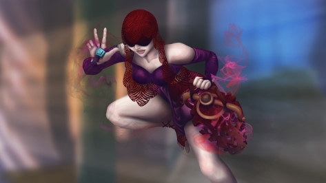
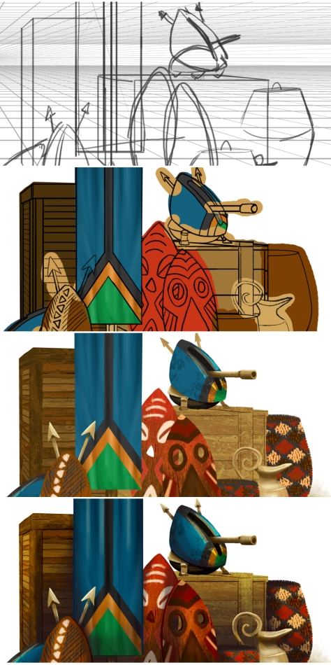
I’ve been planning on going to the SCAD Career Fair for months. I researched everything I could. One company that I would love to work for is near Atlanta, Hi-Rez Studios. Every time I meet someone who works there they are super nice and are active in the local gaming community. I wanted to personalize my portfolio to show that I enjoy their game Paladins. I chose Seris, an oracle and decided to create a new skin for her. I played off the idea of “Oracle” and started with a hourglass as her handheld weapon. Seris01

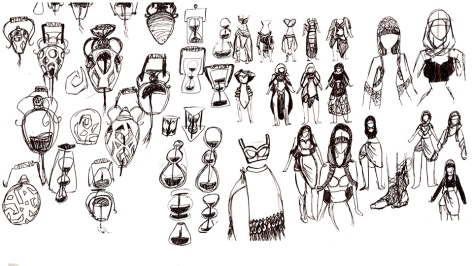
Eventually, I lead to half a hour glass with sand pouring out. I really liked the idea but Seris has smoke. The offhand ended up being a vase of some sorts. Her clothes in the game have a really long skirt and revealing top. I wanted to reverse because she has huge hips! I wanted to showcase them! The skirt is high waist with a nice draping across the front with a short torso with long sleeve shirt. Her veil gave me some issues as I wanted it to be a lace material but I wasn’t rendering it well. It evolved into a fingerprint pattern which I’m really happy about.

Seris02

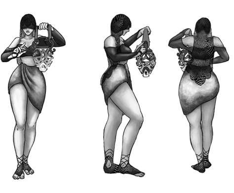
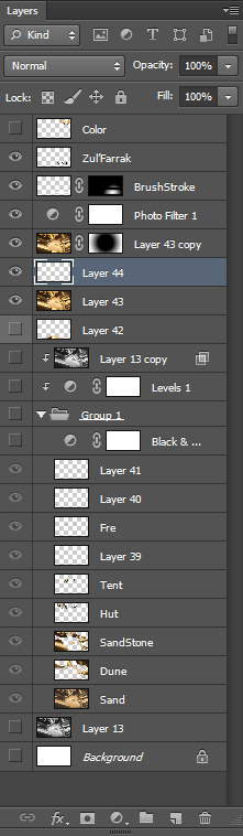
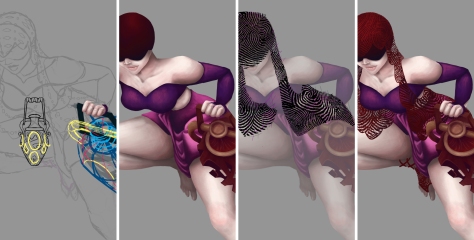
Started with line work and getting everything in proportion, color fill and lace veil. Shadow and lights were last.

Seris03

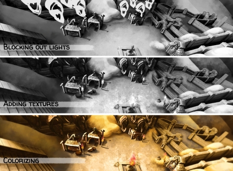
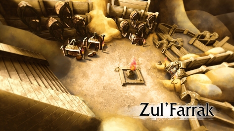
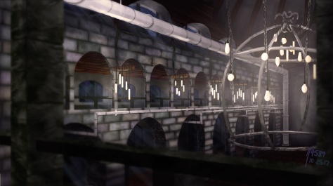
I was inspired by this artist named Karl “Souracid” Liversidge and his fanart of Full Metal Alchemist. The background was this impression with slight mood. I’m not sure if I enjoy what it looks like with my piece but it was fun.Seris04

National Portals

I wanted to work on a style kit or a hero item. Thinking of portals, I wanted a building to hold the portal inside. I usually find portals as a flat plane with a device on the edges holding the portal in place. I started sketching and found I was getting all the bad ideas out of the way.

Sketch01

Branching a little off these sketches I choose three to develop while deciding I wanted three different nations to go with them. I loosely based color and designs off United Kingdoms, China and Africa.

I’m going to start with United Kingdom Portal which is not my favorite. The design got lost along the way. Started with a cathedral but the tusk looking structures changed the feel of image so much.

UnitedKingdomSketchPort01

I haven’t posted it many places but the reason I will on this blog is because of DAT TEXTURE! I love the blue and dirt colors in the rock wall.

Detail

The China Nations Portal has a lotus base with a pleasant design on the sphere’s panels. It looks like Epcot, which wasn’t my intention. I just want contrasting shapes per portal.

ChineseSketchPort02AssetProgression2

Each Portal has a small asset image to accompany the concept. I made little turrets in each one, this one includes a rice hat and samurai style turrets. The flags are designed loosely on the county’s colors.

port04

I had one sketch that look like a mouth, which led to this alligator opening his mouth. I ended up with a pyramid head alligator.

AfricanSketch

I love how the bricks on the pyramid are rendered they are my favorite part of this whole project.

port03port05AssetProgression

This was a really fun original concept that has inspired more personal works that I will eventually share!

Zul’Farrak

I wanted to try something new. Starting in Grey scale and then colorize it. This may not be new for many digital artists but I have never attempted it! Also, it’s an excellent way to work on lighting and shadows.

Starting with the dungeon itself I took reference photos. I focused on the are before the last boss where there’s an event of killing waves of trolls.
ZulREF01

Exploring Kalimdor I ended up in the Dark shore and found an area of trolls. They had the same art assets so some of those are added in.ZulREF03

I really wanted the perspective to be on point. The last environment piece I worked on was the Hummingbird Cage that I drew the perspective in Photoshop and it was…a long process. There was no point in making another long process when there are quicker and better ways. I went to Maya! I blocked out the area, made a camera with the correct settings and added one light. Afterwards, I drew details over the scene and blocked out shadows.

ZulPROG01

Continuing, I blocked out lights/highlights, adding textures to surfaces and finalizing with color.

ZulPROG02.JPG

In hindsight, I should’ve chosen an zone where most of the scene involved different tones. It may not seem like it but the ground, buildings and hills have different tans, oranges and browns from each other.

I hate the lack of organization I had in this project. After watching tutorials and seeing professional artist’s work in Photoshop I made it a goal to be more strict on my layers. I don’t want so many levels where I rely on a backup layer just in case I mess up. I want to draw and color with purpose like I do on paper. It’s easy to redo a line or texture so quickly in Photoshop but that doesn’t mean I should be using it all the time. Most people only see the final project which is nice but under the hood I’m working on my pipeline as well. I got sloppy with naming layers so you begin to see “Layer 44” etc. in post.Layers

After seeing so many videos of other people working in Photoshop I don’t like posting the nitty gritty process. My work is sloppy if you watch it but I’m learning and changing how I work. If this helps an inspiring artist then awesome! Watch me learn and cringe at my terrible workflow Haha.

I would love to explain how I colorized the image but really I followed one video specifically. I found Stanley Artgerm Lau and he has a very informative video on youtube where he explains how he colors a grey scale image. I enjoyed his process and thought he takes a really nice approach.

Zul

Hummingbird Cage

I made an environment piece for my hummingbirds! First of all this piece took way to long to complete and I learned so much while making it. It’s been awhile since I concentrated on an environment only and it was really nice.

My main design elements were to combine Rococo and industrial to create a world that I imagined the hummingbird aerialists lived in. I imagined they’re live-in entertainers that are more of visual aesthetic to the rooms they perform in.

REF

Research included figures on aerial silks any though the final piece doesn’t have one. It took awhile to decide on the type of cage, I would’ve loved a vintage tightly encapsulated one but that wouldn’t have allowed you to see the birds very well.  I had imagined the cage being upside down but due to the overly simple design, it fit as right side up.

HBC_08HBC_05

The whole purpose of this project was to add an environment piece to my portfolio that included perspective. This is where I messed up! What was I thinking? Arches? Vaulted Ceilings? 2 point perspective? WHY?!

Well, now that it’s over I’ve learned that there were easier processes for this. I should’ve made a mock room in Maya. That would’ve been smart and extremely faster. If this was done on paper, getting a ruler out and drawing these lines would’ve been fine. Maybe there was a simple way to do it in Photoshop but what I had figured out seemed to work well enough. There was a lot of copy/paste. The image below shows my work space, it’s a huge canvas that I cropped at the end. The grey area showed me the actual size of the final image while working.

HBC_01

The following image includes snapshots of how I worked throughout the piece. Starts with an clean line art and I began to explore textures.

There was a chuck of research that included 3D models of environments. It helped me to see how other artists lit a scene and what they had to do to the textures for lights. If you look closely to the bricks they started out uniformly grey. After research I included a soft color overlay to different bricks like purple, orange and green.

There’s a moment where I decided I wanted columns and chandelier lights. I did really enjoy the texture of the columns and the lights would’ve looked cool but they didn’t fit within the room. In the end I removed them.

The 6th image is the final with no touch ups like no Curves, no photo filter, no Gaussian blur.

The last two images are very close but I wanted to show that when deciding if I’m happy with the final, I save many versions that have small tweaks. Until I have the last final save that I’m pleased to post and share with everyone.


HBC_02

Overall, I’ve learned so much in making this piece that I will be happy to make another environment piece that would take half the time I used to make this one.

HBC_06

The Neighborhood – Games for Health (Game Jam)

Games for Health GGJ/HHS ended today around 3pm and it was amazing. There were many great games produced this weekend so make sure to take a look at the videos at the SPSU – HHS Games for Health Games Post. Thanks to Berklee College of Music for helping out the teams this weekend.

WE ARE SEMI-FINALISTS!!!!

A total of 42 teams were formed and only 16 teams were chosen in the semi-finals. These teams will have the chance to work on their game this week and present at SIEGE September Friday 3rd, 2014.

I love jamming and sitting there cranking out art. I want to thank Colton Spross and Josh Faubel for being amazing and developing a really elegant functional game. They made my part easier with their clear and focused design. Also, they are pretty funny.

Here’s a look at our card game geared for middle/high schools.

Each player receives a small deck or their specific identification with a number and a shape.

Identity

Life Cards represent activities with a point system represented with 1-3 stars. Friends always worth three stars. Possessions may have two or three stars while insurance and money are worth one. Money may purchase possessions or pay for treatment for HIV Negative/Positive. Insurance pays for treatment for both HIV prevention.LifeCards

At the clinic station the player may take a HIV test. The result is shown secretly to the player. They may tell others of their status and chose to pay for treatment.HIVResult

For more information about HIV Prevention check out the links below.

http://www.cdc.gov/hiv/risk/age/youth/index.html

http://www.cdc.gov/healthyyouth/sexualbehaviors/index.htm

http://www.cdc.gov/lgbthealth/youth.htm

Cydaea – Diablo 3

The first time I saw Cydaea in Diablo 3 I fell in love with her design. I promised myself I would make some kind of fan art with her. So I did!

I made a reference picture. Pulling pictures of her design from official Blizzard art to other fan art.  Just Google Cydaea and these pictures pop up. Ugh, she is so cool.

CydaeaREFReference images are not mine.

I began with her pose. I decided I would like to show the full body in an elegant pose because her title is Maiden of Lust. Although, she would tear your face off.  I referenced ballroom dancing to help me position her arms and hands. The bottom shapes are the sizes of her legs.

CydaeaV1

 Next step, I made a line drawing of the design of the armor and details. The line work is scratchy up close. I roughly draw lines then erase away to where I want the shape to be. I blocked in where the blacks/darks will be to help me figure out where the design gets too dense.

CydaeaV2

I removed the lines and did a quick light study before the coloring step.  I blocked in colors and then erased it to the shape it needed to be in. This process took longer than I expected but I’m glad I tried it. The total amount of time to digitally paint Cydaea was about 4 and a half days.CydaeaV3

Visual Storytelling 1 Final

Updated Behance to show the Visual Storytelling 1 Final. Truly, I am enjoying every class I go to for sequential. The hard learning curve in the beginning was worth sticking through because I enjoy the work I put into these projects and the final product.

This project was the first time I have written a script for my comic. Writing an interesting story for three pages with 5-7 panels on each one was challenging. This subject matter was difficult to fit into those requirements and I hope the three page story is successful. I am also not found to coloring but this story is close to my heart that I really tried to  be mindful of my insecurities with color. Coloring the pages on Photoshop was more enjoyable than I anticipated. I would like to try to color my pages more often.