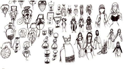
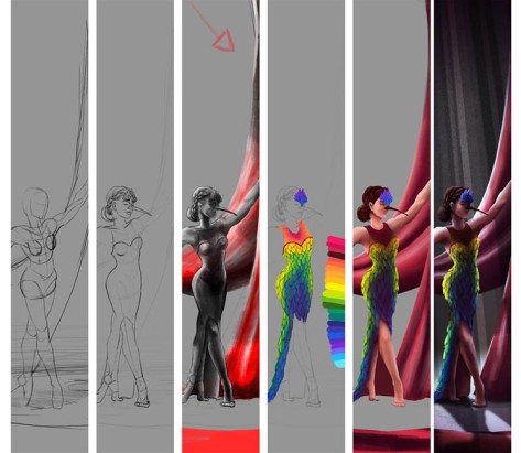
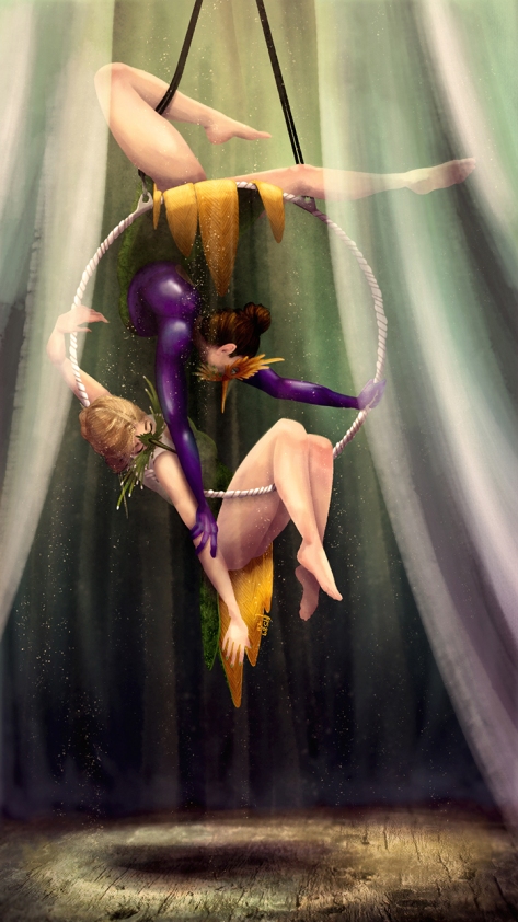
I’ve been planning on going to the SCAD Career Fair for months. I researched everything I could. One company that I would love to work for is near Atlanta, Hi-Rez Studios. Every time I meet someone who works there they are super nice and are active in the local gaming community. I wanted to personalize my portfolio to show that I enjoy their game Paladins. I chose Seris, an oracle and decided to create a new skin for her. I played off the idea of “Oracle” and started with a hourglass as her handheld weapon.
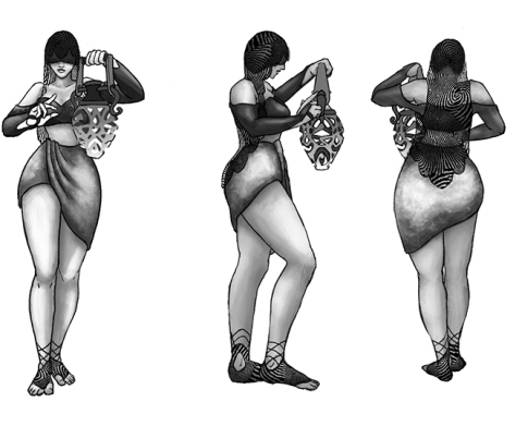
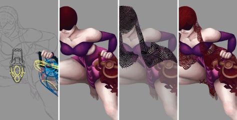
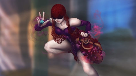
Eventually, I lead to half a hour glass with sand pouring out. I really liked the idea but Seris has smoke. The offhand ended up being a vase of some sorts. Her clothes in the game have a really long skirt and revealing top. I wanted to reverse because she has huge hips! I wanted to showcase them! The skirt is high waist with a nice draping across the front with a short torso with long sleeve shirt. Her veil gave me some issues as I wanted it to be a lace material but I wasn’t rendering it well. It evolved into a fingerprint pattern which I’m really happy about.
Started with line work and getting everything in proportion, color fill and lace veil. Shadow and lights were last.
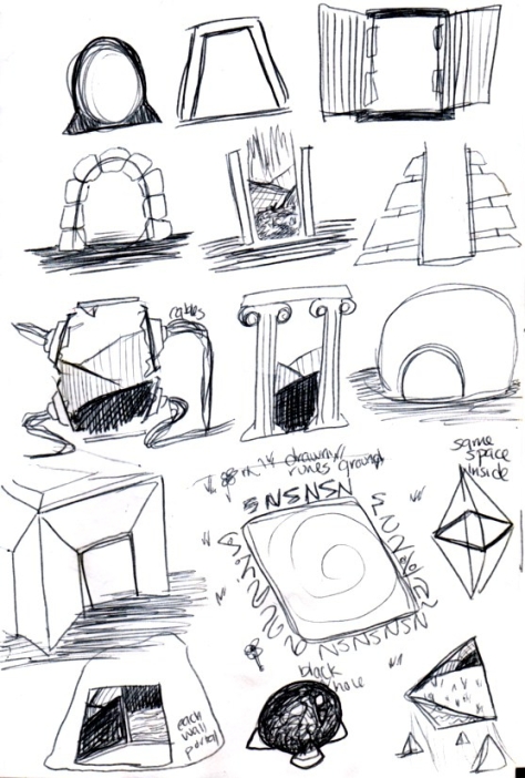
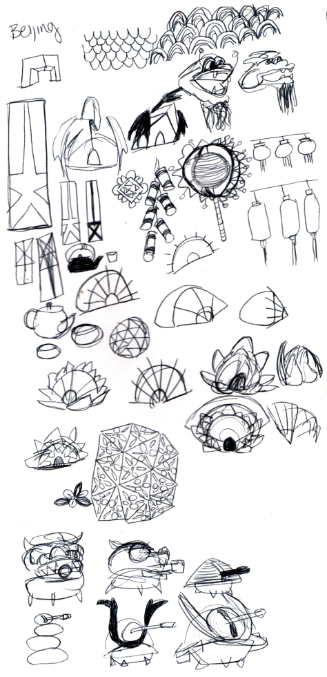
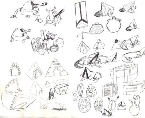
I wanted to work on a style kit or a hero item. Thinking of portals, I wanted a building to hold the portal inside. I usually find portals as a flat plane with a device on the edges holding the portal in place. I started sketching and found I was getting all the bad ideas out of the way.
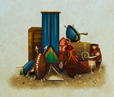
Branching a little off these sketches I choose three to develop while deciding I wanted three different nations to go with them. I loosely based color and designs off United Kingdoms, China and Africa.
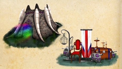
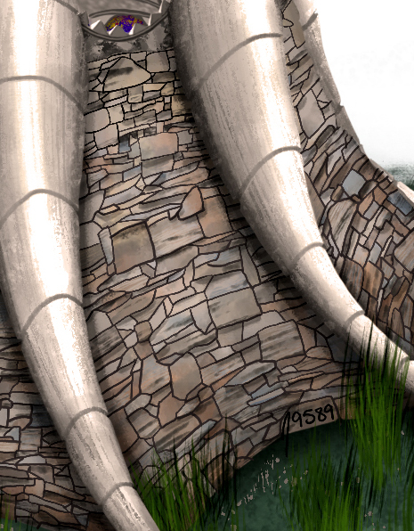
I’m going to start with United Kingdom Portal which is not my favorite. The design got lost along the way. Started with a cathedral but the tusk looking structures changed the feel of image so much.
I haven’t posted it many places but the reason I will on this blog is because of DAT TEXTURE! I love the blue and dirt colors in the rock wall.
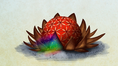
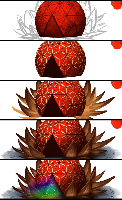
The China Nations Portal has a lotus base with a pleasant design on the sphere’s panels. It looks like Epcot, which wasn’t my intention. I just want contrasting shapes per portal.
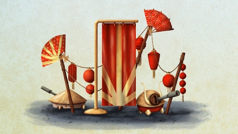
Each Portal has a small asset image to accompany the concept. I made little turrets in each one, this one includes a rice hat and samurai style turrets. The flags are designed loosely on the county’s colors.
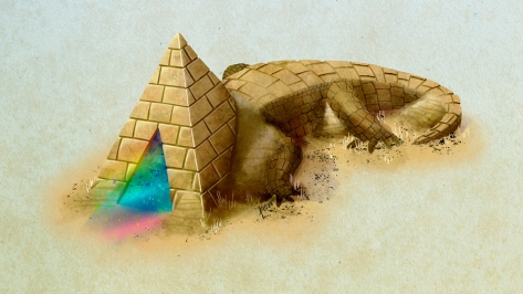
I had one sketch that look like a mouth, which led to this alligator opening his mouth. I ended up with a pyramid head alligator.
I love how the bricks on the pyramid are rendered they are my favorite part of this whole project.
This was a really fun original concept that has inspired more personal works that I will eventually share!
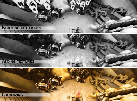
I wanted to try something new. Starting in Grey scale and then colorize it. This may not be new for many digital artists but I have never attempted it! Also, it’s an excellent way to work on lighting and shadows.
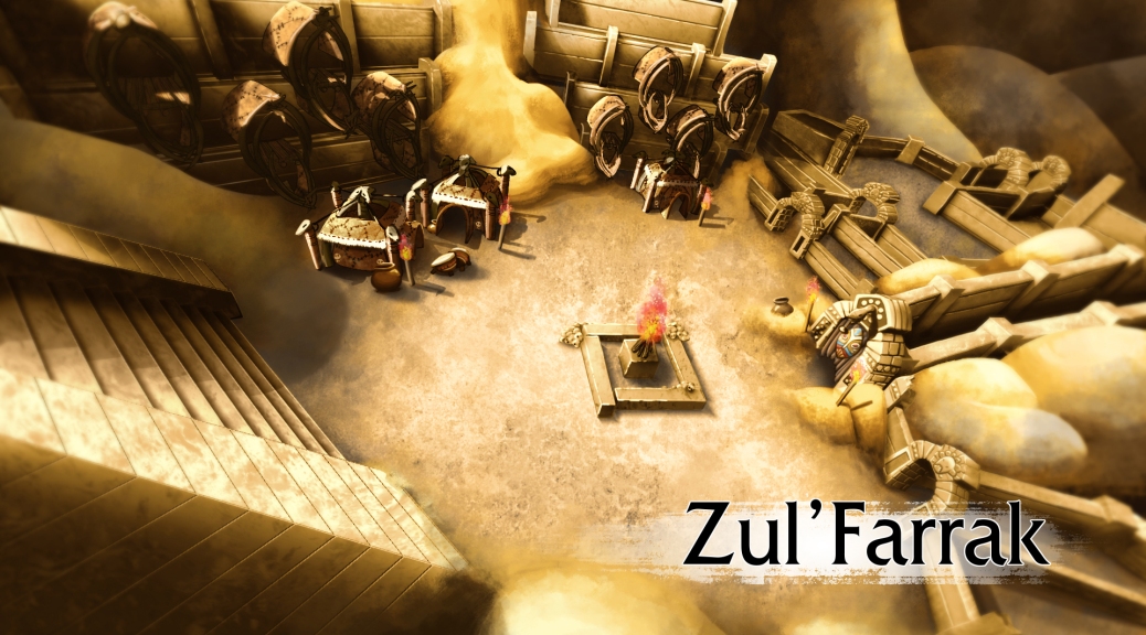
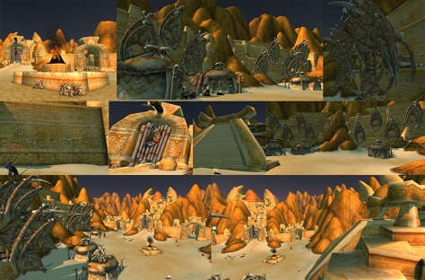
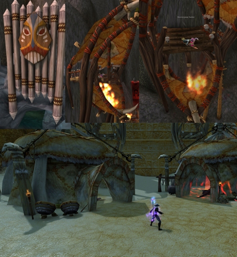
Starting with the dungeon itself I took reference photos. I focused on the are before the last boss where there’s an event of killing waves of trolls.
Exploring Kalimdor I ended up in the Dark shore and found an area of trolls. They had the same art assets so some of those are added in.
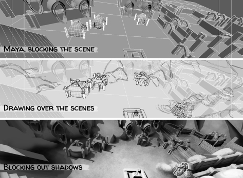
I really wanted the perspective to be on point. The last environment piece I worked on was the Hummingbird Cage that I drew the perspective in Photoshop and it was…a long process. There was no point in making another long process when there are quicker and better ways. I went to Maya! I blocked out the area, made a camera with the correct settings and added one light. Afterwards, I drew details over the scene and blocked out shadows.
Continuing, I blocked out lights/highlights, adding textures to surfaces and finalizing with color.
In hindsight, I should’ve chosen an zone where most of the scene involved different tones. It may not seem like it but the ground, buildings and hills have different tans, oranges and browns from each other.
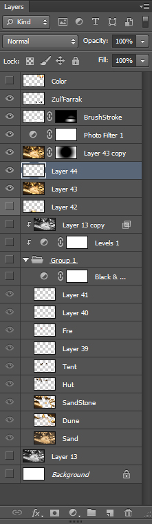
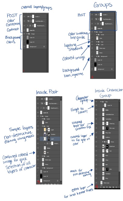
I hate the lack of organization I had in this project. After watching tutorials and seeing professional artist’s work in Photoshop I made it a goal to be more strict on my layers. I don’t want so many levels where I rely on a backup layer just in case I mess up. I want to draw and color with purpose like I do on paper. It’s easy to redo a line or texture so quickly in Photoshop but that doesn’t mean I should be using it all the time. Most people only see the final project which is nice but under the hood I’m working on my pipeline as well. I got sloppy with naming layers so you begin to see “Layer 44” etc. in post.
After seeing so many videos of other people working in Photoshop I don’t like posting the nitty gritty process. My work is sloppy if you watch it but I’m learning and changing how I work. If this helps an inspiring artist then awesome! Watch me learn and cringe at my terrible workflow Haha.
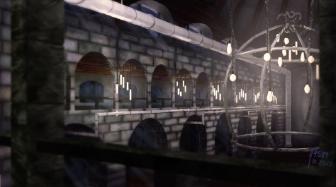
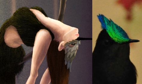
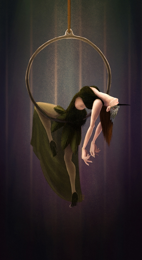
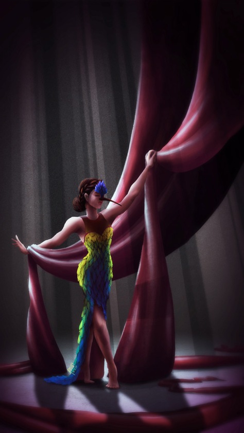
I made an environment piece for my hummingbirds! First of all this piece took way to long to complete and I learned so much while making it. It’s been awhile since I concentrated on an environment only and it was really nice.
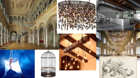
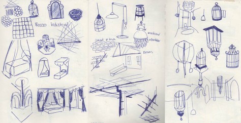
My main design elements were to combine Rococo and industrial to create a world that I imagined the hummingbird aerialists lived in. I imagined they’re live-in entertainers that are more of visual aesthetic to the rooms they perform in.
Research included figures on aerial silks any though the final piece doesn’t have one. It took awhile to decide on the type of cage, I would’ve loved a vintage tightly encapsulated one but that wouldn’t have allowed you to see the birds very well. I had imagined the cage being upside down but due to the overly simple design, it fit as right side up.
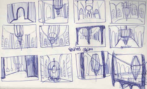
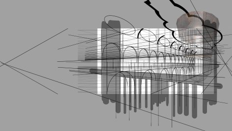
The whole purpose of this project was to add an environment piece to my portfolio that included perspective. This is where I messed up! What was I thinking? Arches? Vaulted Ceilings? 2 point perspective? WHY?!
Well, now that it’s over I’ve learned that there were easier processes for this. I should’ve made a mock room in Maya. That would’ve been smart and extremely faster. If this was done on paper, getting a ruler out and drawing these lines would’ve been fine. Maybe there was a simple way to do it in Photoshop but what I had figured out seemed to work well enough. There was a lot of copy/paste. The image below shows my work space, it’s a huge canvas that I cropped at the end. The grey area showed me the actual size of the final image while working.
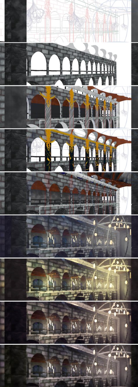
The following image includes snapshots of how I worked throughout the piece. Starts with an clean line art and I began to explore textures.
There was a chuck of research that included 3D models of environments. It helped me to see how other artists lit a scene and what they had to do to the textures for lights. If you look closely to the bricks they started out uniformly grey. After research I included a soft color overlay to different bricks like purple, orange and green.
There’s a moment where I decided I wanted columns and chandelier lights. I did really enjoy the texture of the columns and the lights would’ve looked cool but they didn’t fit within the room. In the end I removed them.
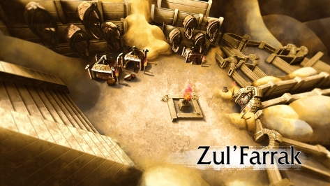
The 6th image is the final with no touch ups like no Curves, no photo filter, no Gaussian blur.
The last two images are very close but I wanted to show that when deciding if I’m happy with the final, I save many versions that have small tweaks. Until I have the last final save that I’m pleased to post and share with everyone.
Overall, I’ve learned so much in making this piece that I will be happy to make another environment piece that would take half the time I used to make this one.
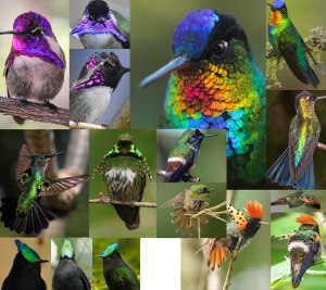
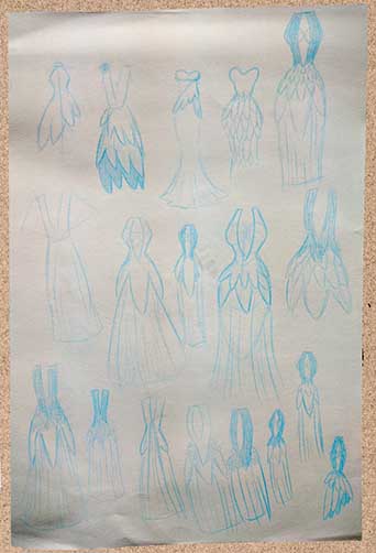
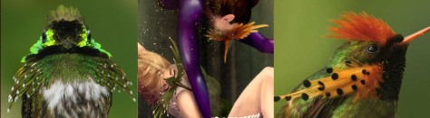
I was inspired by some colleagues when it was hip and new to revisit older works and remake them for a comparison. Watching others showing the progress they made through out the years was great to see. It reminded me of an ambitious project I started in middle school that I never finished. I had a grand scope for masquerade inspired dresses based off different hummingbirds. I had sketches of the Antillean Crested, Costa, Fiery Throated, Tufted/Festive Coquette, Horned Sungem and a Rainbow Starfrontlet. I choose four sketches and began!
Humming Bird referenceCosta Humming Bird
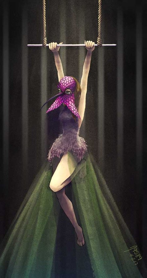
It has been awhile since I started a project and was eager to get going. I desperately wanted something done. More concerned about having a finished project, I barreled through to the final. I’m still happy with the outcome but I sacrificed so many aspects that make artwork good. With the pieces following, I take a closer look at my process and try to make something I’m proud of.
Costa Humming BirdAntillean Crested Humming Bird
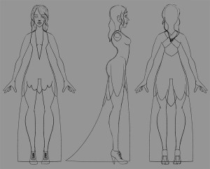
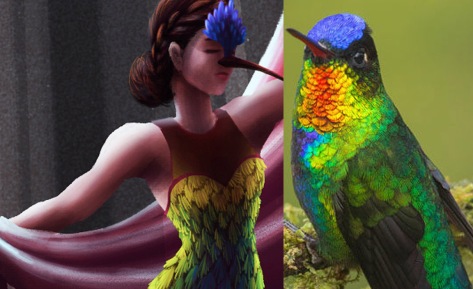
With the Antillean Crested Hummingbird I took the proper steps for starting a project. Sketches, explored poses and different types of equipment used in acrobatics. I wanted to emphasize the different types of feathers on the Antillean using soft light feathers on the chest and hard flight feathers from the tail. The designs below are based around the initial middle school design.
I even made myself a terrible guide for how the dress laid on the figure!
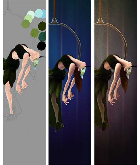
When I start in Photoshop, I begin with a line drawing and color swatches eventually leading to the background and coloring the character with no final touches. Ending with color correct, enhancing lighting, shadows and add ambient features.
Antillean Humming Bird
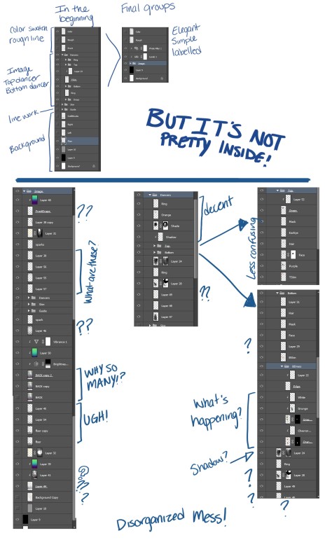
Labeling layers keep the workflow easy and quick helps the project go smoothly. During the Antillean I stayed on top of labeling my layers and navigation was easy. During the Coquette’s image, I did not label my layers and it made finishing the piece tiresome. Here’s an image of my Antillean workflow!
Relatively clean workflow with all layers present and not merged.
Simple enough layers to work smoothly with no guessing what layer I’m on! I strive to have my layers this nice because it’s a great habit. Also, if working with multiple people it’s easier for them to decipher. The next image is of the Coquette and shows how out of control working in Photoshop can be if you do not label layers.
I wanted one image that involved aerial silk because the other images have lyra hoops. Trying to vary it up a bit I drew the Fiery Throated Humming Bird with silks and also on the ground. Also, I wanted to tackle a challenging lighting scenario so the key light is behind everything. The only interesting process is the dress itself. Each feather detailed out only to be mainly masked behind shadow. I find this look to be ok only because rainbows can be so blinding to look at, plus this lighting makes color super moody.
Process goes rough, clean lines, rough light/shadow to color swatches. The dress alone has quite a bit of layers. Making a rough pass of shadows adding more and more until I reach the final look.
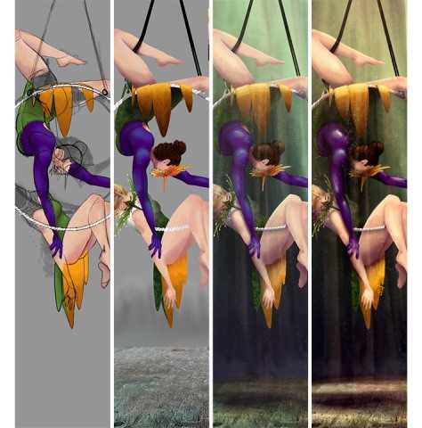
For the final piece I wanted to push what I’ve been doing, like poses that were less stagnant and embracing light. I choose to have two figures on a lyra hoop overlapping each other. Originally, the poses were mirroring each other but I ultimately decided that it was boring.
I asked a colleague of mine for a critique on the lighting and shadows. He asked if I had any references. This stunned me because I had a style guide, references for poses, birds and fabric ….but nothing for lighting! So, time for more research. This made me realize I should practice light and shadows. It’s a practice I skip over in sketches all the time but is an important aspect that I should stop ignoring.
I went through at least 10 different versions tweaking lighting because my layers were so messed up it took forever to find what layer was blowing out my work. Anyway, more research and pushing the image more I eventually complete the Coquette piece. The two humming birds are very similar but are based off two types called Festive Coquette and the Tufted Coquette.
Coquette Hummingbird
These pieces get better than the one before because I begin to take the proper steps instead of barreling through. I’m glad the Costa was made the way it was. With what’s been happening in real life I have not been working on artwork. I really wanted to say I made something and I did …but the quality suffered. Comparing the Costa and Coquette shows what preparation can do. I was able to get back into the groove of things by the end of this series. I always wanted to make this series a reality and it happened! Glad to be back doing what I love.
Usually, I would make a post during and after the GGJ but this year was a little different. The GGJ site near me was hosted at Savannah College of Art and Design (SCAD) Atlanta, I saw many of my school colleagues there and catching up with them was great.
Unfortunately, the community lost a great person that evening. Tony Tseng passed away shortly before the Game Jam started and with the recent news SCAD cancelled the event at the Atlanta campus. I met Tony from participating in game jams, interactions with Production Club, and the Video Game Club at SCAD. He was a fantastic motivator and inspiration to many students and faculty.
The Jam continued at many locations including, SCAD, Georgia Tech, Emory, Southern Poly and some people went to their homes to compete. It was a very sporadic Game Jam this year filled with passionate people. Southern Polytechnic State University and outstanding members of the community like Molly Proffitt and Andrew Greenberg were able to keep the Jam going with their organization and offer a space available for the closing ceremony.
My team consisted of Colton Spross, AJ Kolenc and Josh Faubel whom I have worked with in past game jams. As a group they call themselves The Stork Burnt Down. They are always a blast to work with and they have some funny jokes.
2015 theme: What do we do now?
They threw a few ideas around and the one that we voted on to work on was a game based around building furniture….without instructions. Our video submission has a nice voice over that explains the game quite well.
The judges were able to play all the games made over the weekend. They sent in their votes later on in the week and two teams won.
Who thought multiplayer furniture assembly would sound so interesting right? Well, If you would like to play the game YOU CAN! The game is available to play at The Stork Burnt Down itch.io page.
Below is a closer look at the art assets I made for the game and at the very end of the post are some interesting reviews from other bloggers and news rooms.
Art Assets
Reference Image
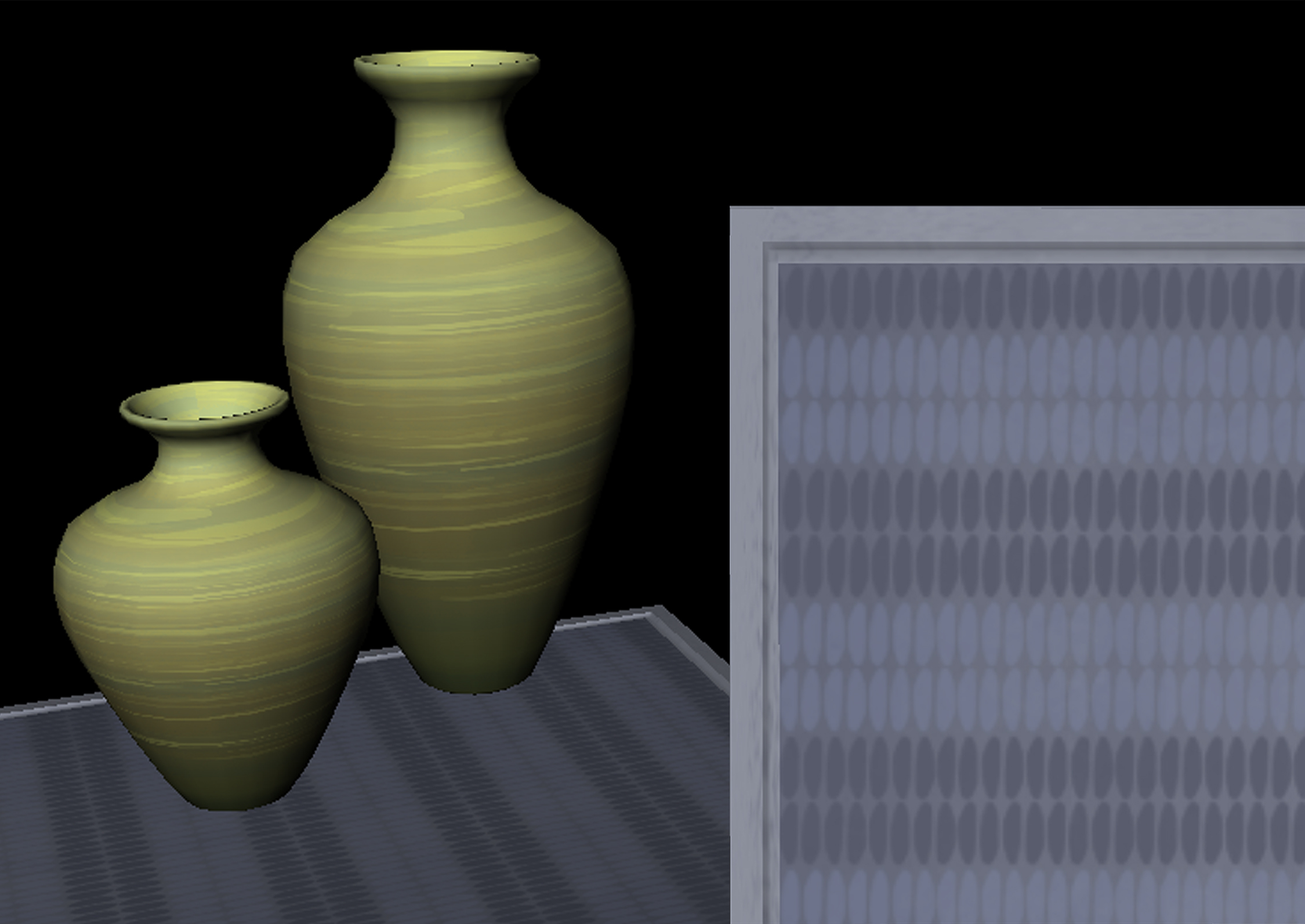
Simple idea with simple art assets. I opened up Maya and quickly thought about the last time I had opened the program was over a year ago. I definitely spent some time acquainting myself with the program again. I 3D modeled room assets like molding, window, curtain etc.
Look at that gorgeous molding.
The couch has a nice trim with a slight lighter blue color. The chair isn’t implemented into the playable version….yet.
I love the rug texture, it’s just enough.
Texturing was very simple. We wanted the room to be clean and crisp. Simple brush strokes to add some sort of variety. They are not exciting to look at by themselves so here is a sample of the vase and rug textures.
The room itself was looking pretty nice. There needed to be room to build more furniture so not much is in the room. However, the curtains and windows were dominating the other wall so I made some picture frames!
They silently judge your ability to assemble furniture.
There are many Youtubers who are playing the game and showing their experience as a player. Local News rooms are also making posts about the game which is so exciting! I am stunned to see so many people interested in the game we produced during the Global Game Jam 2015. It’s exciting to see the players reactions range from frustration to happiness and vice versa.
My husband and I have been playing Diablo 3 a lot lately. I have been playing the crusader class. I love wielding a two handed flail with a tower shield, RAAHAHGHGHG!!! So she inspired my next art piece but I wanted a story element where I could combine environment and character to really hone in on a mood. I thought being on a crusade especially in a world like Diablo 3 would be horrifying. Being mentally and physically strong enough to carry on, to live for something bigger than yourself.
I decided to show a female crusader in between fights in a place where she would process what’s happening. The location is inside the first church where you start ‘Reaper of Souls’ expansion. There is a great spot where the light is streaming through the stained glass onto some pews and dead bodies litter the ground … perfect. As always I began with some research.
I logged in, dyed my armor and took some screenshots of the area in the church and my character.
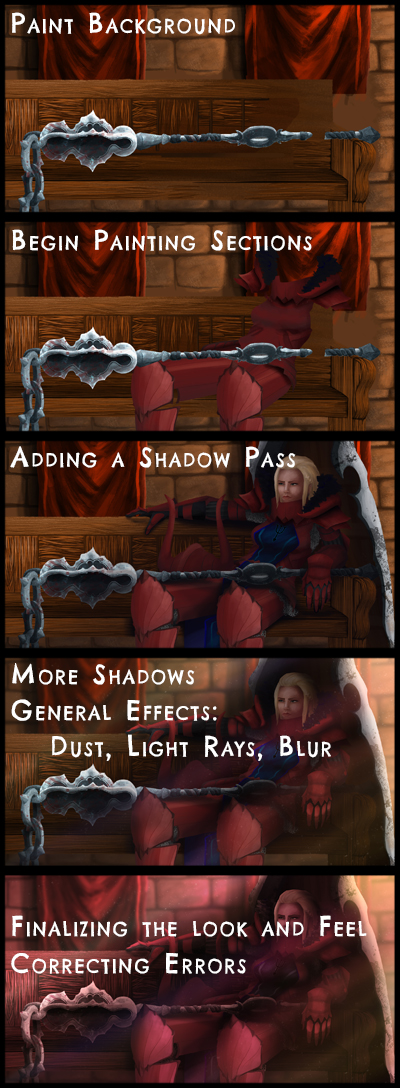
Next step include thumbnails. For someone interested in this work you need more than just three thumbnails. I was being lazy … Shame on me. But I choose the middle one and started a rough under drawing.
At this point I try to keep the drawings separated so I can lasso individual pieces and move them around. I have three groups labeled for Concept work, the parts of the body and rough light study. It’s good practice to keep layers named.
When the position and perspective is correct I merge the layers to begin the next step of blocking in color with a clean work area.
I use the brush and eraser around 30%-50% opacity for lighting. I make so many layers and work on small areas while bouncing around the whole page I don’t worry about naming the layers. While added light and shadow I am double checking form, composition and make notes. Around this time I send out the test image to a few people for an extra set of eyes (Alex and Demorrius Thanks!).
I reference this rough light study throughout painting. After I choose my color palette, I begin to paint!
Towards the end I will take a lot at color correcting. Placing a color filter over the image. I send this test image to a few people for feedback.
The Crusader image should have been finished weeks ago! Life was hectic the last two weeks but I’m glad to finally be able to post the Crusader!
Games for Health GGJ/HHS ended today around 3pm and it was amazing. There were many great games produced this weekend so make sure to take a look at the videos at the SPSU – HHS Games for Health Games Post. Thanks to Berklee College of Music for helping out the teams this weekend.
WE ARE SEMI-FINALISTS!!!!
A total of 42 teams were formed and only 16 teams were chosen in the semi-finals. These teams will have the chance to work on their game this week and present at SIEGE September Friday 3rd, 2014.
I love jamming and sitting there cranking out art. I want to thank Colton Spross and Josh Faubel for being amazing and developing a really elegant functional game. They made my part easier with their clear and focused design. Also, they are pretty funny.
Here’s a look at our card game geared for middle/high schools.
Each player receives a small deck or their specific identification with a number and a shape.
Life Cards represent activities with a point system represented with 1-3 stars. Friends always worth three stars. Possessions may have two or three stars while insurance and money are worth one. Money may purchase possessions or pay for treatment for HIV Negative/Positive. Insurance pays for treatment for both HIV prevention.
At the clinic station the player may take a HIV test. The result is shown secretly to the player. They may tell others of their status and chose to pay for treatment.
For more information about HIV Prevention check out the links below.
I believe the Georgia Game Jam is now the Health Game Jam? CDC must have really liked this event. The game jam started 10.25.2014 at the Southern Polytechnic State University and we have Berkelee College of Music to help us out. For those who don’t know about this event, teams are challenged to create a game within 48 hours.
This year my group is different and quite small. The subject/theme of this year’s game jam is HIV awareness and prevention. Some unique challenges are ahead of us. Judging this year is a bit different as well.
We’re making a card game! Whaaat? Yes, a card game, I’m quite excited. The game is ideal for a middle/high school classroom environment but really any big group could play. Currently we only have a few card types and our team is so small we have one artist, me. Time to crank out some illustrations! I decided the art style will be intricate and colorful with simple shapes. I pulled references from Google and none of the reference images used in the style guide are mine.
GGJ 2014 Style Guide
So far the money card is the most complete but still needs more textural impressions, text and possibly numbers? Who knows at this point.
UPDATE: Here are the friends cards! These cards are to help demonstrate stigma of getting tested. Only these two for now. The stars are apart of the point system.
Tower of Cans:
8:00pm Friday 26th – We just started how did these already get here? More importantly, where are the Yohoos?
September 26, 2014 – 8:00pm Tower of Cans
10:00am Saturday 27th, 6:30pm Saturday 27th
They added plastics!
They had plenty of food here and as a result there’s a fort.
All boxes, cans and bottles are recycled at the end of the game jam.
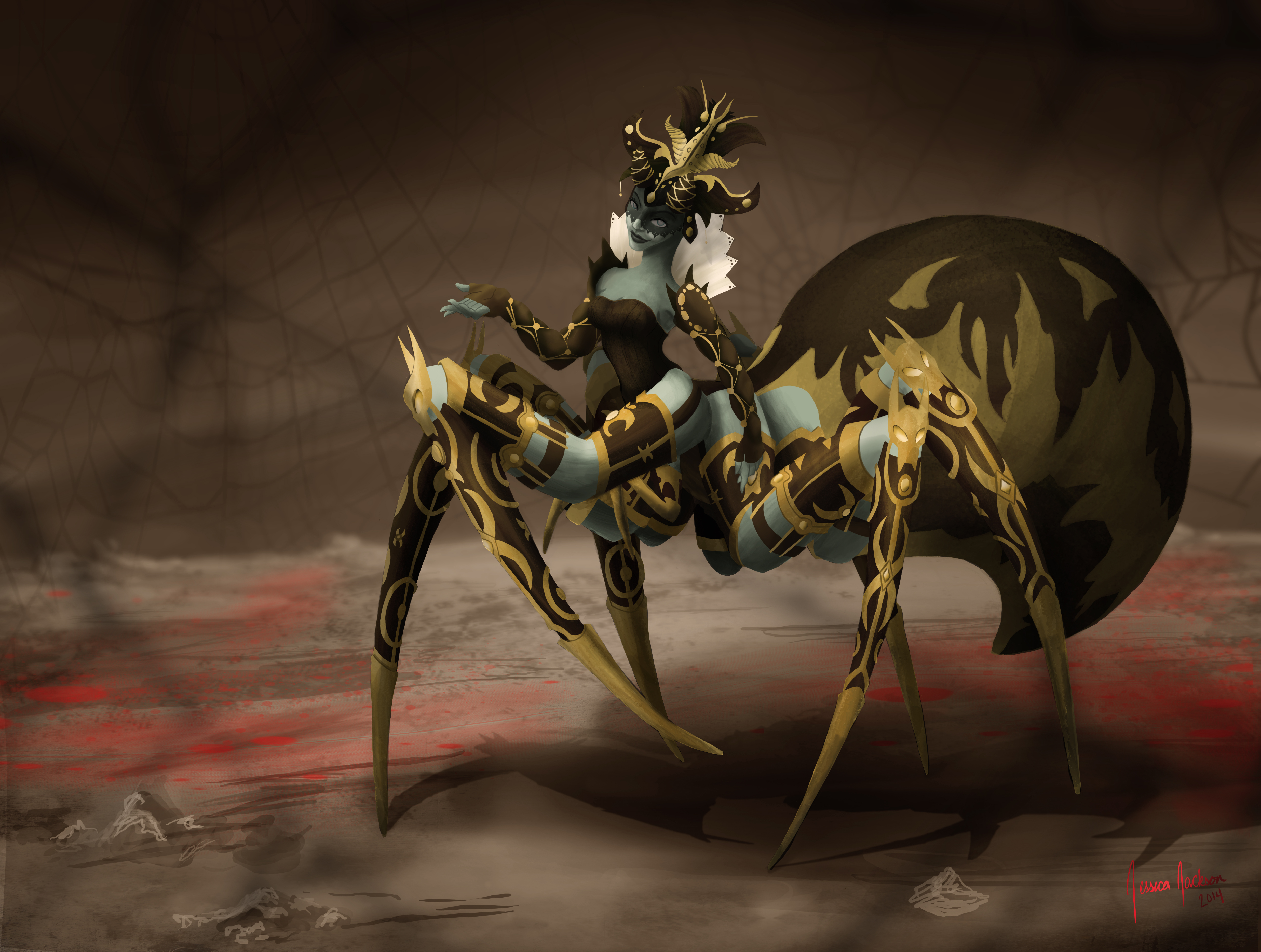
The first time I saw Cydaea in Diablo 3 I fell in love with her design. I promised myself I would make some kind of fan art with her. So I did!
I made a reference picture. Pulling pictures of her design from official Blizzard art to other fan art. Just Google Cydaea and these pictures pop up. Ugh, she is so cool.
Reference images are not mine.
I began with her pose. I decided I would like to show the full body in an elegant pose because her title is Maiden of Lust. Although, she would tear your face off. I referenced ballroom dancing to help me position her arms and hands. The bottom shapes are the sizes of her legs.
Next step, I made a line drawing of the design of the armor and details. The line work is scratchy up close. I roughly draw lines then erase away to where I want the shape to be. I blocked in where the blacks/darks will be to help me figure out where the design gets too dense.
I removed the lines and did a quick light study before the coloring step. I blocked in colors and then erased it to the shape it needed to be in. This process took longer than I expected but I’m glad I tried it. The total amount of time to digitally paint Cydaea was about 4 and a half days.